
Begin your journey in TerminalFour
Find answers to your 'how to' questions
Explore the many templates you can use
Discover layout options for your pages
Attend a training class
Get help to create a new form
See best practices for writing web content
Guidance for using images on your website
Make your web content accessible to all users
Learn how to make your content rank higher in search engine results
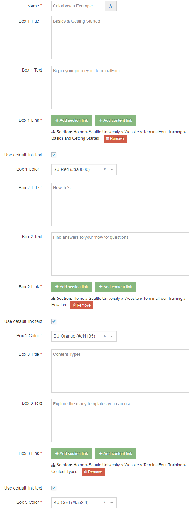
As you can see in the example above, the Color Box Navigation content type enables you to add between three and six boxes in the top zone of your homepage or landing page, or in Zone A, with a content or section link.
You can select one of our 11 SU brand colors including black, brown, dark blue, dark green, emerald, gold, green, light blue, orange, red, and white, for each box.
Similar to the Jumbotron content types, this content type is designed to be used to facilitate navigation to other parts of your Seattle U website.
Navigate to the section where you wish to add this content item. Click "Create content" then select the "Color Box Navigation - Top Zone" or "Color Box Navigation - Zone A" content type.
Please note: "Color Box Navigation - Top Zone" can only be used with a Landing Page or Homepage page layout. Click here to find out how to change your page layout.
The look and size of this content type will vary depending on whether your page is configured to go full width or fixed width (less than or equal to 1170 pixels).
You can change the width of your site in your "Section Customizations" folder. You should find a "Site Configuration Options" content type, and within that content item, you can easily select between a fixed width or full-width style for all of your pages.