Graphic Elements
Explore key graphic elements, including icons, patterns, and textures, that define our brand's visual identity and ensure cohesive design across all platforms.
In addition, the following graphic elements, help create and strengthen a cohesive and recognizable brand across all visual communications.
Arrow-Tree Symbol
The Arrow-Tree symbol is a prominent element within the SU brand. It was created to represent the distinct foliage that surrounds the campus and why Seattle is known as the Emerald City. It was also developed to communicate the idea of forward-thinking and progression, which are the key tones behind brand. The symbol is primarily used as a detailed element that calls attention to smaller components of a design rather than being used as an assertive feature within any body of work.

Redhawk
The Redhawk is a prominent element within the SU brand. It was created to represent school spirit for any occasion. The symbol can be used as a detailed element that calls attention to smaller components of a design or it can be used as the main component of a design when called for. The Redhawk is a great way to add school pride and recognizable identity to any piece.

Patterns and Textures
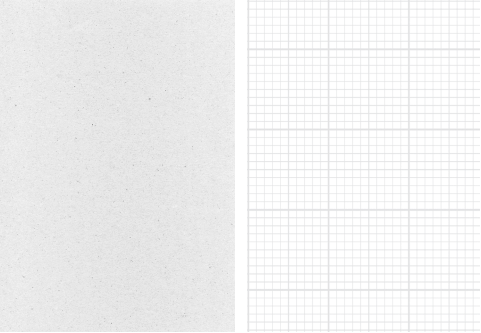
Utilizing textures and patterns may be used to add depth and visual integrity to your design. They should never be used in a way that calls too much attention to texture(s) itself. Think of them as final touches or added detail that aid in bringing about the crafted and authentic feel that represents the brand.


More information can be found on the Redhawk Hub.